retooling
event discovery
Company
Thermo Fisher Scientific
When
Summer '23
Purpose
UI Redesign
Goal
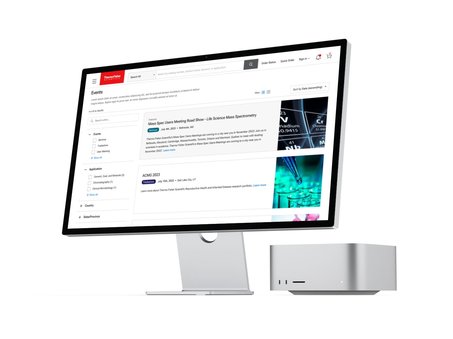
In the summer of 2023, I was tasked with overhauling the current Thermo Fisher event page. My primary goal was to transition from the current state into a new page that would unify common event page affordances with the company styling.
Problem Statement
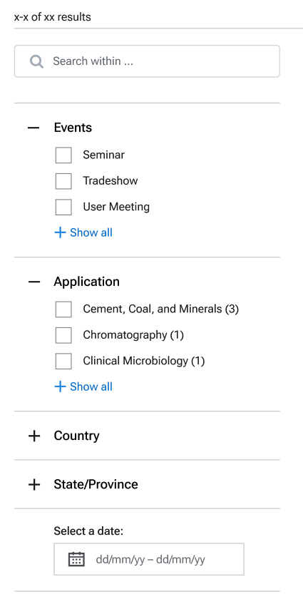
Users need to filter and find events that pertain to them specifically.
The layout should encourage a natural flow of discovery.
The style needs to be updated with common design elements found throughout the overarching site.
Creating more context for the user was the most critical starting point for this redesign. I wanted to add more clues to the user to understand how open-ended the event catalog was and provide them clear starting points to filter down the upcoming events to the ones they would specifically be interested in. I created a wireframe which led into a low-fidelity mockup of various elements pulled together from different pieces of research and current style elements on our site.
The goal for the event page framework was two part:
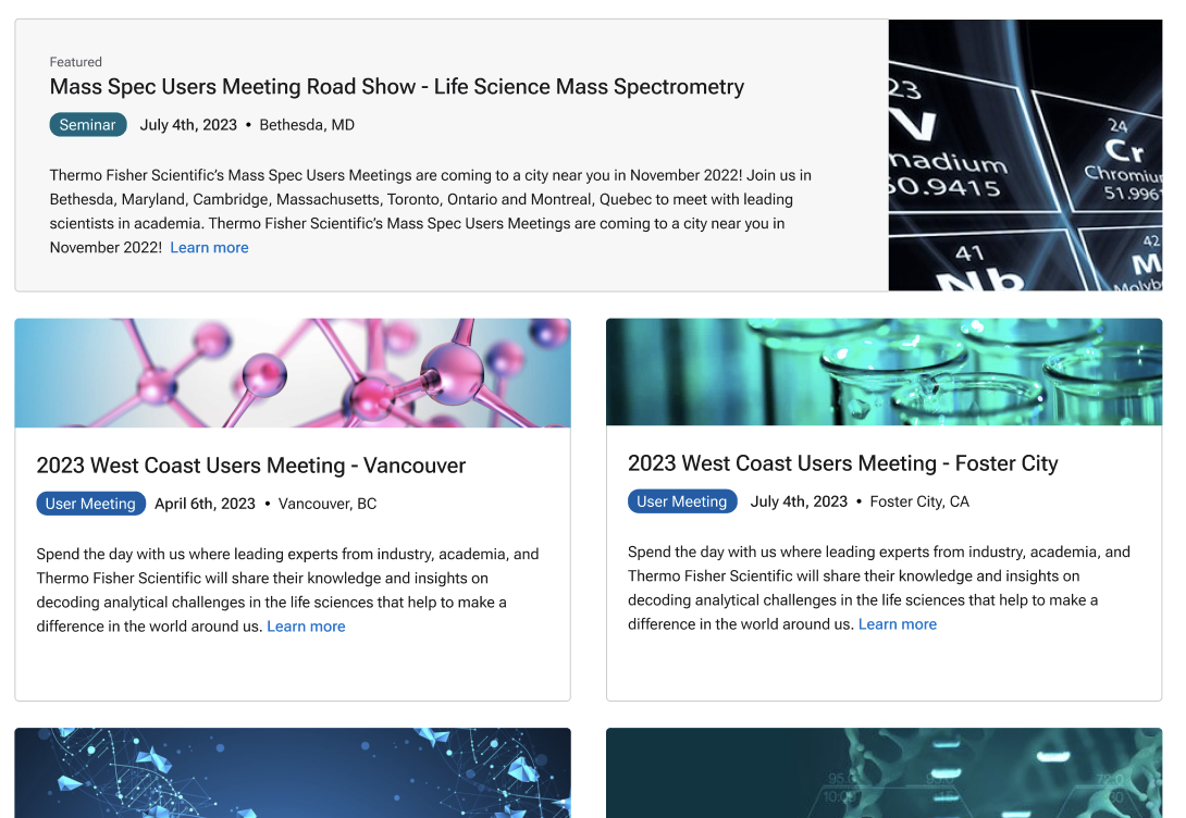
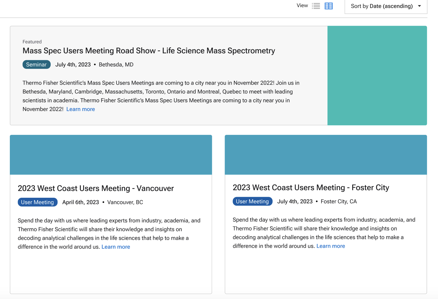
One later addition was the featured events card. A subtle "Featured" tag and light grey background did wonders for accentuating the event while making later rotation and replacement seamless. The color change borrows upon recognized highlighted event patterns while not affecting the contrast.
This was a request from the business, and was a useful exercise in managing expectations and compromise. While featured events were common, my main concern was filtering down the correct event for the user. Unlike larger event sites, the featured event wouldn't be able to adapt to the appropriate category to take their best stab as the correct event for the current user.
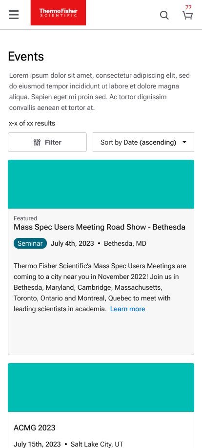
In a survey sent out to Thermo Fisher users in early 2023, it was found >60% of users preferred mobile devices. Responsive design was already a core part of our design mission, but it soon became an imperative aspect. In this design, I had proposed a card based layout with responsive design in mind as it would allow us to build the new event page around more flexible components.
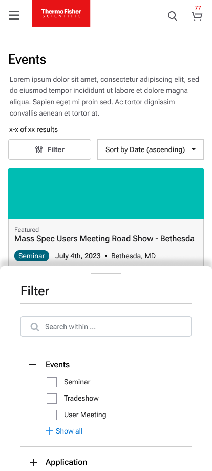
Moving the filters into a modal made sense to avoid cluttering the layout, and we gave access through an easy to identify button. I shied away from either making the Filter button or the Sort by dropdown more visually distinctive to balance any decision making weight in the user's perspective,
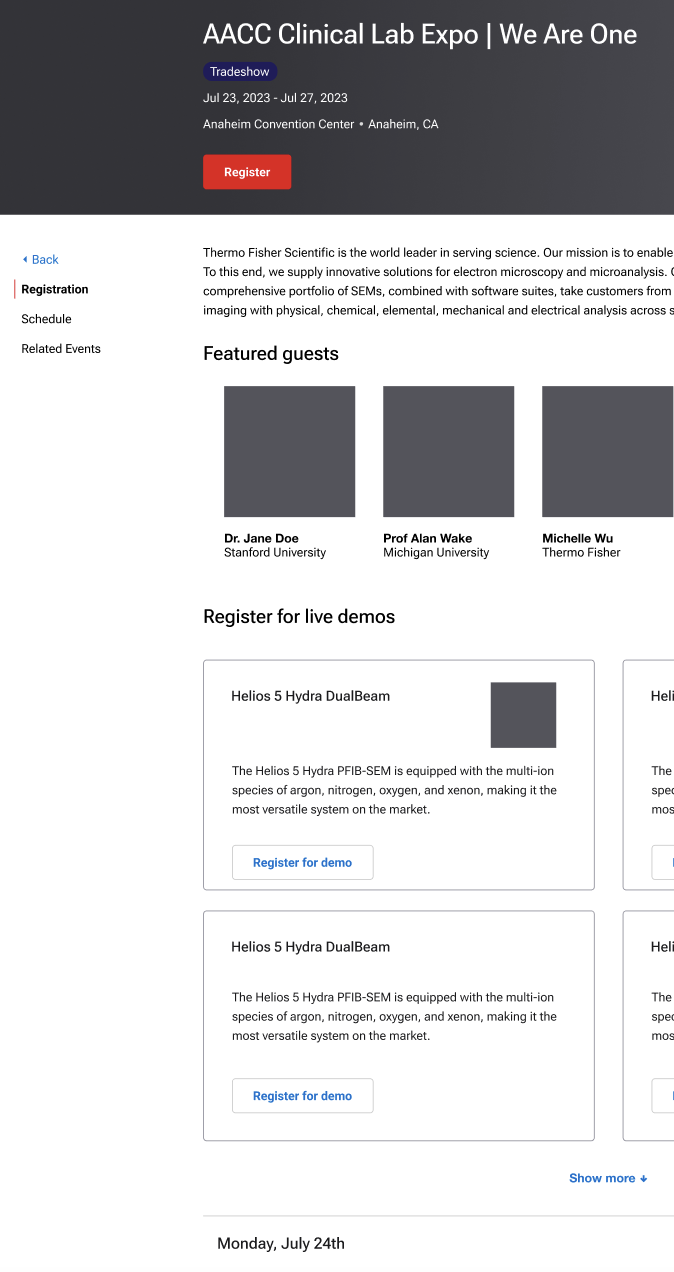
The final step in the process was designing layouts for child pages. This began as as simple template but began evolving after we reviewed the many different types of events. It was clear that a unifying template was needed for the sake of consistency.
The goal of this layout was to prioritize information that contextualize the event. Then branch out that knowledge to the products and related areas with multiple paths to registration distributed throughout the page.
Anchoring the whole page was the heading. Compared to the event cards, the heading on the child page offered a more comprehensive overview of the event specifics. Venue would be listed here along with times if applicable. The heading would be complete with the primary CTA as the centerpiece.
All in all, the child pages were intended to be flexible for the most part. The intent behind designing a more comprehensive child page example was to help the businesses designing event pages and ensure users would have a familiar structure to rely upon when browsing various events.
All in all, I consider this a success when considered as a revamp as the original event page. My only regret for this project is that I wasn't able to send it off to production and follow up with user research that would validate the changes made for the user. However, the project was left in trusted hands with the Thermo UX team.
This my largest solo project by far in terms of responsibilities and depth. While I had a lot of support from teammates and my manager, there was room to be a larger advocate for research. While the focus on deliverables was deserved, data that would help dictate the most optimal decisions was severely lacking.
Here is a prototype of the desktop if a quick run-through is desired.