What started out as a simple class project turned into one of my favorite parts of 2020. I had the fortune of working with a great team, and design an app that would deliver the farmers market experience. Our focus on farmers market originated from a shared love of our experiences at various farmers market, and the observed popularity of grocery stores like Trader Joe's and Whole Foods which both cater towards a fresh and local appeal. We also learned through our initial research that there were no good apps for looking up local farmers markets. We sent out a survey to gauge the response to a farmers market app and to get a better idea of grocery shopping habits. We got a total of 67 responses and our most significant findings were as follows:
My team conducted interviews on potentials users with a diverse range of ages. We all chose interviewees that were the primary grocery shopper for their household to get a better idea of how regular grocery shopping habits would influence the desire and ability to attend farmers markets.
One key insight we took away from our primary stakeholder interviews was that there are different types of farmers markets. Some provide more produce options and focus on that while others focus on food and various artisanal products, more like a food festival or event.
“Lived in St. Louis...a completely different set up…so many fruits and vegetables…get all my groceries.”
“I’ve gone to the Little Italy Farmers Market as a hangout with friends.”
Our interviewees often see farmers markets as an alternative to grocery shopping rather than something that could be their main grocery shopping source. They can’t get everything they need just at a farmers market and sometimes have to buy specific things at certain stores like Trader Joe’s and ethnic grocery stores.
“It’s kind of an expensive organic market for college students that I don’t have the money for.”
“I avoid multiple stores in one trip because I’m worried about food going bad in the car.”
Along with interviewing a range of potential users, we also were able to talk to a current vendor at farmers markets to understand their perspective and see if there were ways we could help them connect to their current or potential customers.
One common point that came up throughout the interview was that our vendor was really invested into the relationship he had with customers. He enjoyed educating them on his farm and the ways he managed to be environmentally sustainable. This specifically revealed the potential vendor-customer relationship that we could explore while working on the app idea.
When asked about what he would like to see from an app about farmers markets, he replied he didn't really want to do anything. He emphasized that with his current workload, he wanted to avoid any extra work on his end such as posting on an app. Going ahead, my team agreed we should look only for solutions that could be crowd-sourced or easily implemented by a team working on the app.
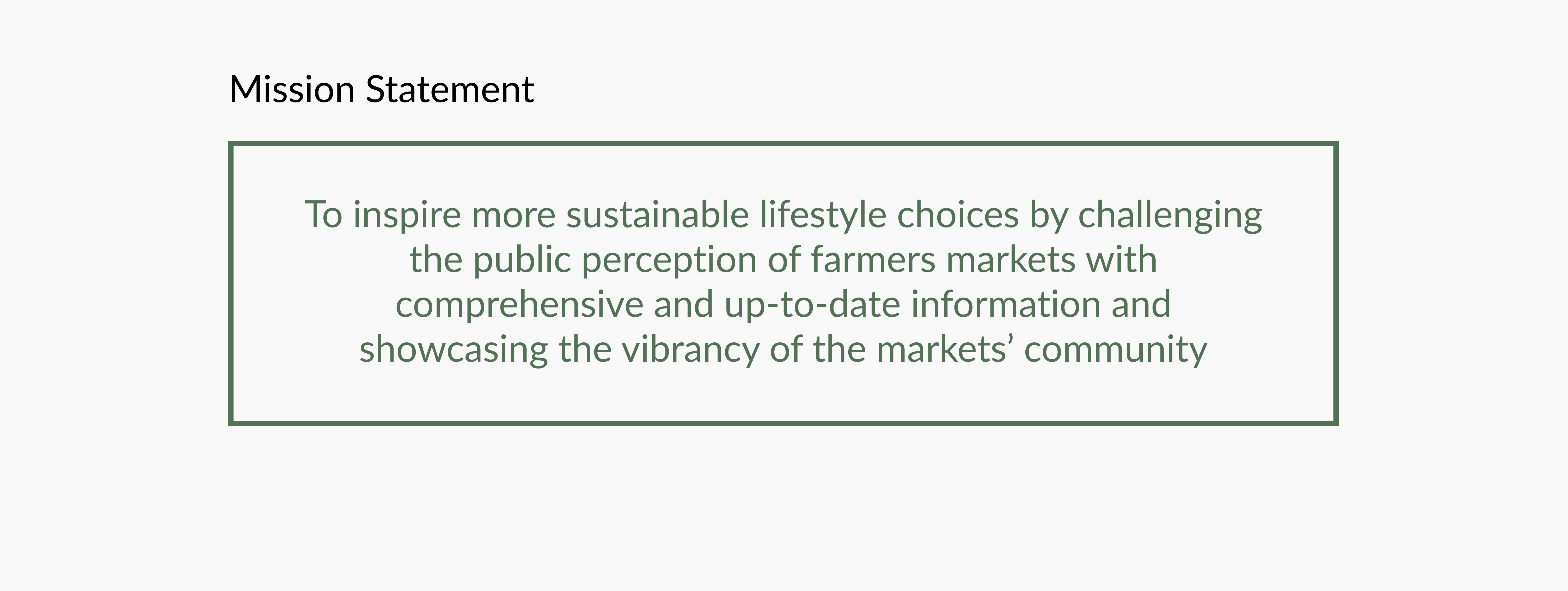
The interview made it pretty clear that he wanted a more hands off approach to any app, so we integrated that into our core mission by making sure the app was user-focused without a need for vendor interaction.
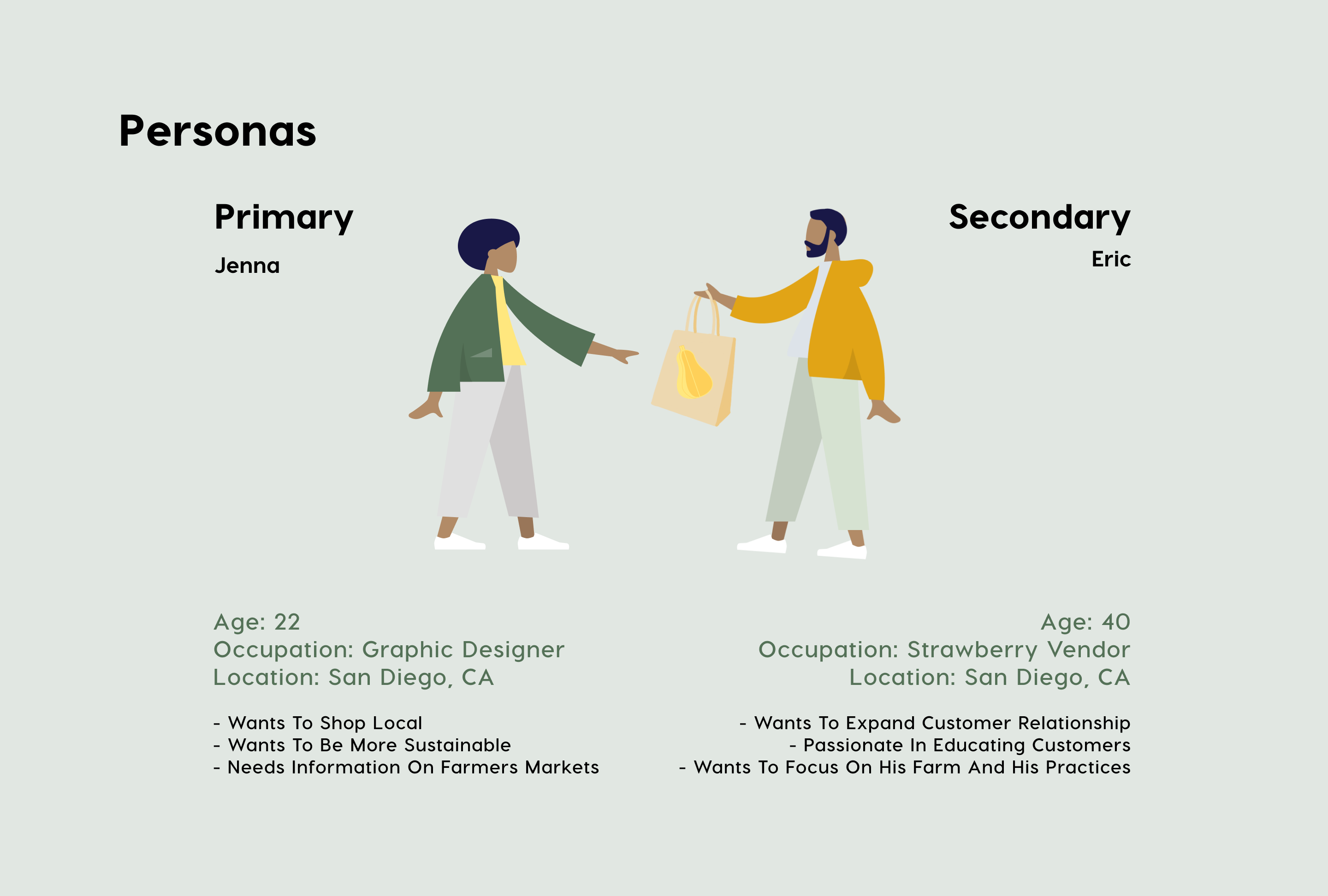
These above insights really informed our personas by showing us the vast difference in needs between our primary users, farmers market attendees, and the secondary user, vendors. Even though we had a diverse range of ages in mind for our potential users, our largest user base would be ages 20-30 who have the greatest incentive to use our app. We knew that a digital native, fresh out of college would have the desire to start shopping at farmers markets but none of the knowledge a more experienced shopper would possess.
We were ready to tackle the first challenge of designing an user friendly interface. After coming up with a range of storyboards for potential features, we tackled the layout of the app. We split off to individually sketch possible layouts to get a range of perspectives on what the app could look like.
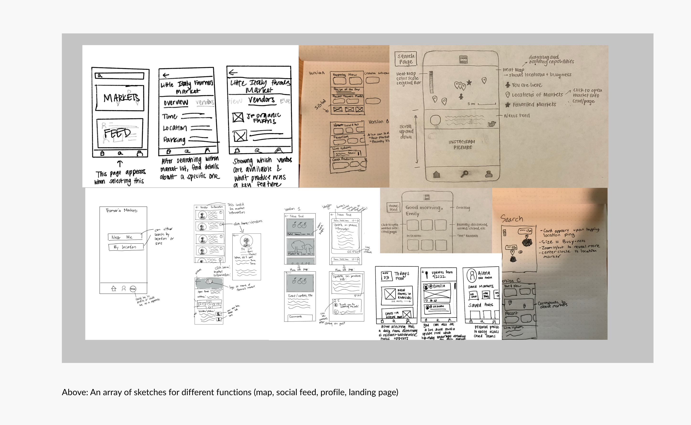
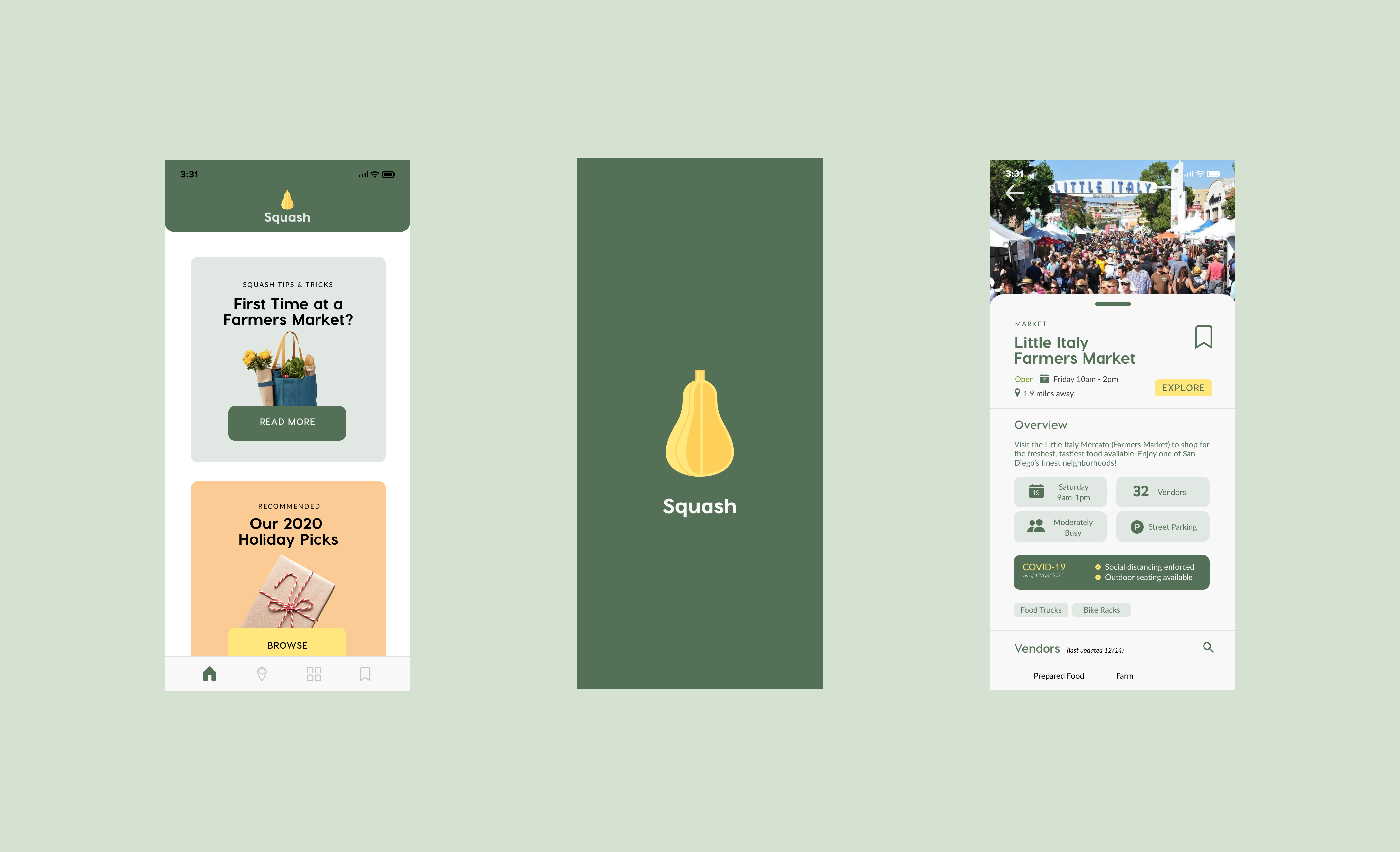
When we approached the layout, one organizational approach we took was to start from the navbar. Even though we didn't physically draw out a flowchart for the navbar (constraints of zoom/no whiteboard), we discussed the merits of having only a few buttons available. When we were looking at the competitive apps for farmers markets, the UI suffered from either bloat of too many features, or an unintuitive navbar that raised more questions upon exploration. We decided the best way to make sure the user could focus on their purpose was to have a simple and straightforward navbar. By uniting the team under this methodology, we decided our app would be centered around three main functions: a landing screen, a map, and a profile.
.png)
After we discussed our sketches, we went into wireframing. We would look at examples of good UI (Spotify, Google Maps) in our meetings and try to pick out things that worked in those examples. Building off the sketches, we were able able to develop tentative screens for each section of our app. Building our wireframe on Figma allowed us to seamlessly move into developing the low fidelity prototype.
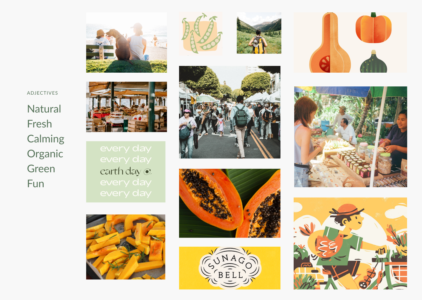
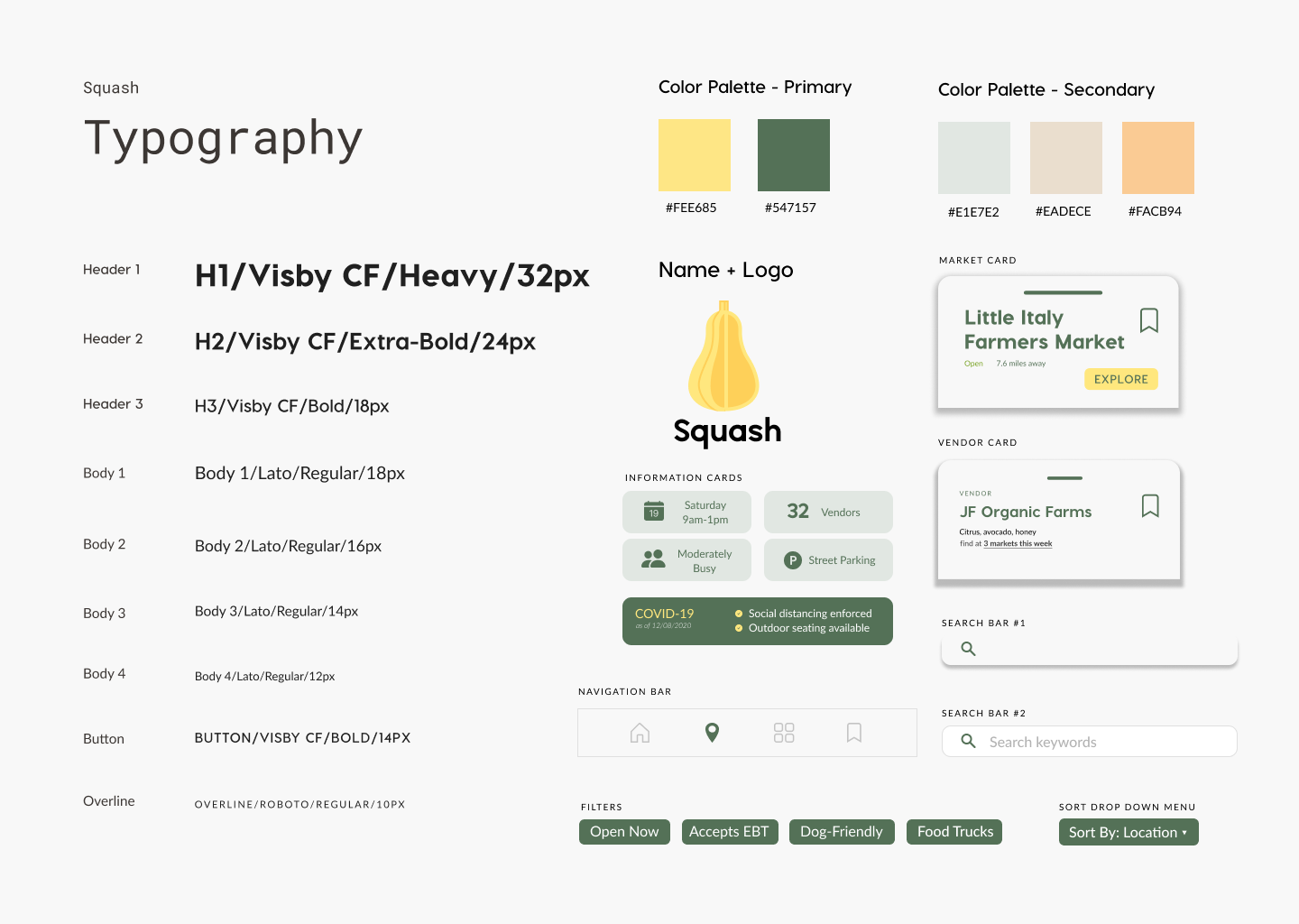
I really enjoyed creating a mood board and style board for this project because of how much I learned working with my teammates. We were asked to create a logo and title for our app, even though we were not taught how to effectively create branding. We opted to go through a bottom up process, using our mood board and eventual style sheet to inform the direction of our app's branding. Our color palette reflected our desire to capture the laidback and natural vibe of farmers markets.
One of the first major areas of development came when I started to notice a problem with our color scheme. Early iterations of the high fidelity prototype had a dark green(#547157) and I had concerns this color scheme would interfere with readability and future implementation of features.
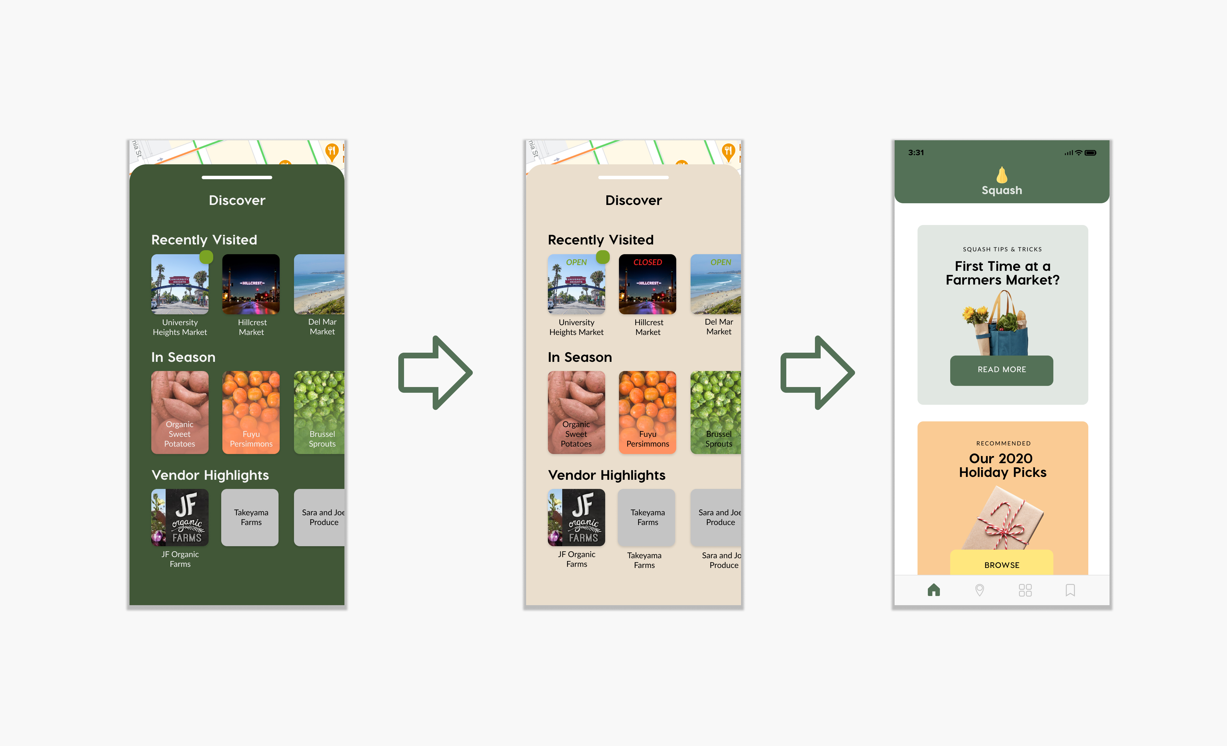
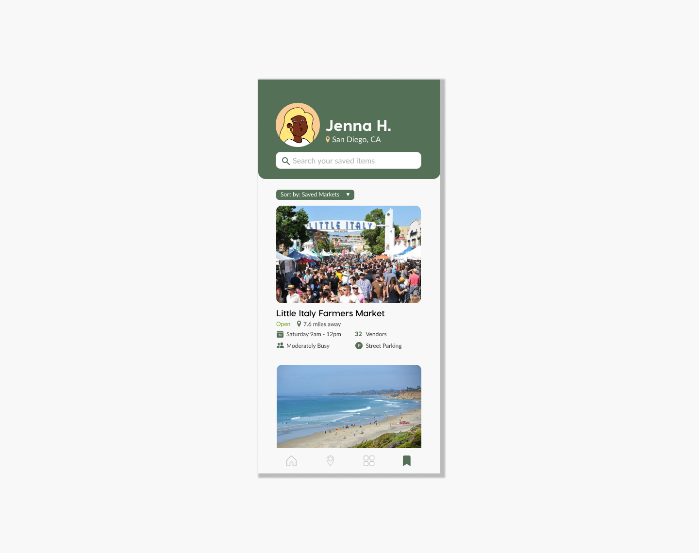
Due to some initial hesitancy to overhaul the color scheme, I spent time outside our meeting creating an array of alternatives that I thought would solve the contrast issues. My examples used lighter pastel colors, and I proposed that the darker green and yellow should be left for CTAs and highlighting high-priority information. After being able to compare the varying examples, my team agreed the information possessed a higher level of readability with a lighter palette. We moved from using a dark green as the background color, to a beige, and finally settling for a off-white(#f8f8f8). As we added more information and varying colors, it was apparent how the lack of background color led to a smoother visual scan.
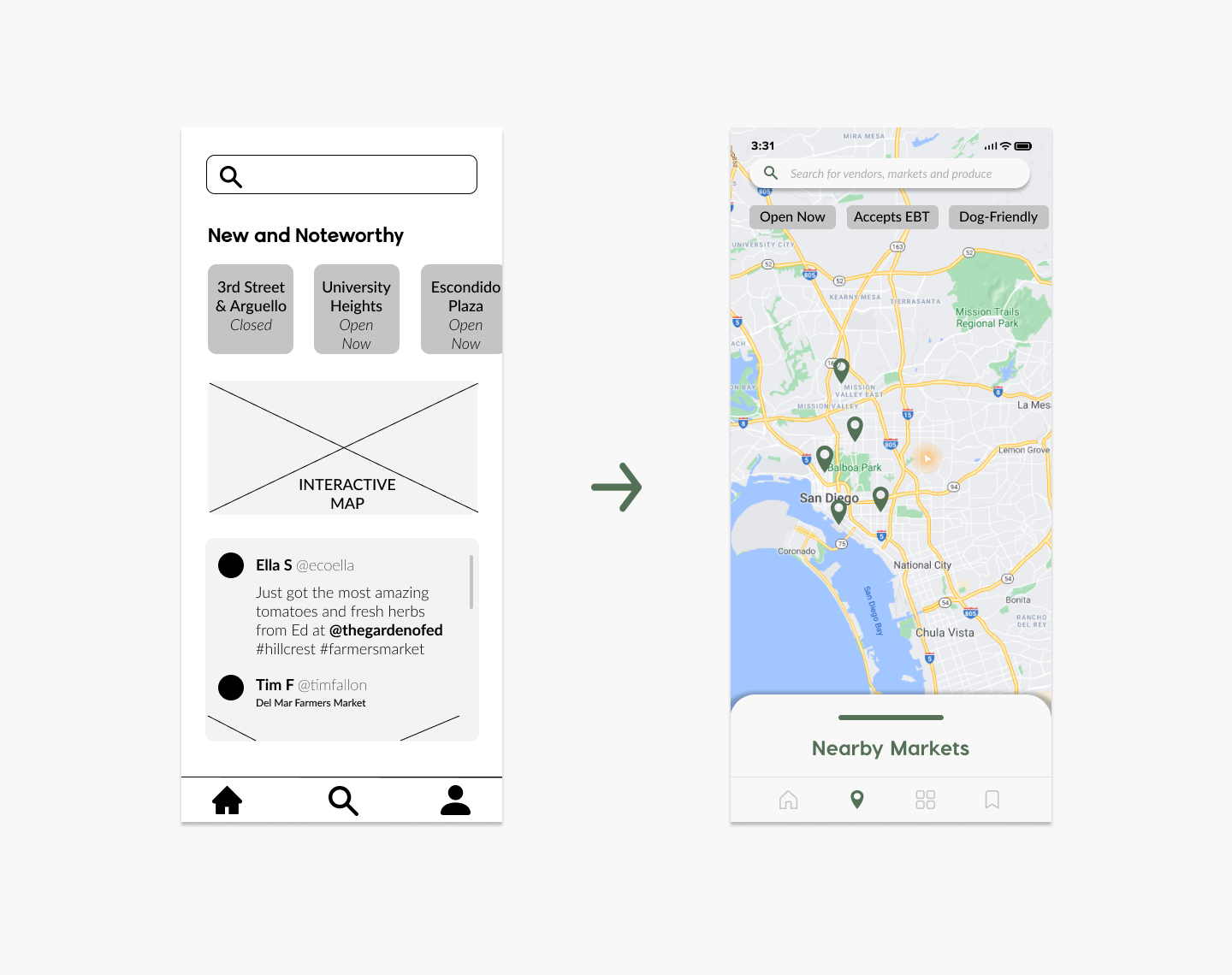
Once we we had a general idea of our style sheet, we went ahead and conducted some user testing on our lower fidelity prototypes. The users liked the features, however they found the layout confusing and felt that the features were too broad and unfocused. Instead of having multiple, unclear features on the page, we simplified each page to a singular purpose. We eliminated confusing aspects while adding key signifiers to make the affordances clear. Our map was one example where we expanded the interface for easy navigation and use, but while offering several prompts for unsure or new users.
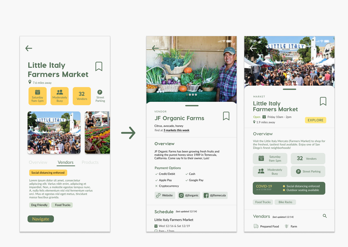
We moved on to creating our high fidelity prototype, and conducted another round of testing on our target users. One valuable insight from our high-fidelity user testing was that a user wanted to follow their favorite vendor from market to market. We realized that our current system was market-centric, and didn't offer flexibility for viewing the individuals vendors who move between multiple markets in a week. We designed pages for both vendors and markets that highlighted vendor/market-specific features and were organized by priority to the user. Additionally, the market/vendor card system was implemented with the development team in mind. We hoped that having a common point of reference would simplify the overall app architecture.
Based on our personal experiences with farmers markets, we wanted our app to be 100% experience focused. Each feature of our app seeks to eliminate an obstacle between the user and their potential trip to a local farmers market. In the process of designing this app, we considered a lot of possible features but wanted to keep on-app time to a minimum to ensure that busy people could find the time to get fresh groceries at farmers markets.
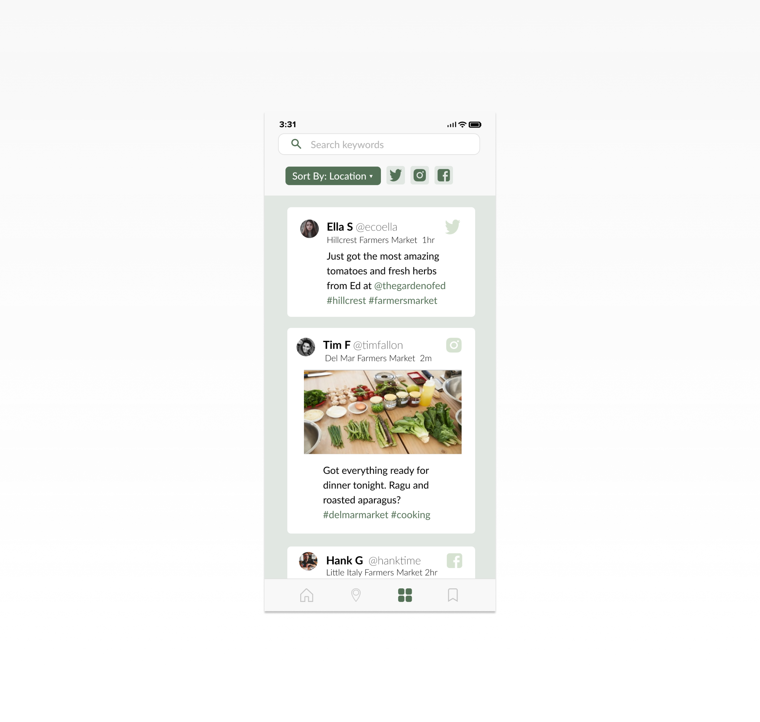
Throughout the design process we discussed many possible features that we believed integral to the farmers market experience. This included features like recipe centers, grocery lists, personalized recommendations and ways of elevating engagement with the platform. Through iteration and testing, we came to the conclusion that the majority of these features were not necessary for the average user to accomplish their goals of grocery shopping. However, the social feed was the one feature we kept even though it doesn't directly help the user plan out their farmers market trip. The main value is that it centralizes relevant posts, and keeps our user connected with their community.
I really enjoyed my time during this project because I really enjoy farmers markets and this project allowed me to create a user centered experience. Farmers markets are an essential part of a neighborhood and will continue to play a pivotal role in our communities for years to come.
Some key takeaways from the project:
This was the first prototype I built from the ground up, and I'm grateful I had such a good team. I was really grateful for the opportunity to push myself during the few weeks we had for this project.