Bumble Bizz
Daniel Han, Pauline Thatch
Fall 2020
Redesign
Problem Statement
Many networking professionals are struggling to establish real lasting connections due to the shift of in-person to virtual interactions. How can we improve Bumble Bizz so that Bumble Bizz users acquire refined matches that lead to opportunities beyond the app?
.png)
Bumble offers 3 sides to the app: Dating, Friendships, and Business. Each service operates in a independent pool of users, but shares a lot of the same functionality and core concepts. Bumble Bizz, their networking platform, borrows liberally from their dating component of the app, and falls short of professional networking aspects. We want to help users focus on engaging with their networking matches and improve Bumble Bizz while trying to remain faithful to their style and ideologies.
Research
We took a two pronged approach to research. We wanted to interview current users of Bumble Bizz to find possible pain points and we also wanted to gather info from people who don't Bumble Bizz, but have a desire to network. On bumble, my team matched with multiple people to begin informal interviews on the app. For the other pool of users we created and sent out a survey on as many platforms as we could.
Survey
Linkedin is the dominant platform
Networking in a pandemic?
We asked the participants separate questions to gauge their frequency of networking before and during the pandemic. Since the beginning of the pandemic, a significant portion of our respondents said they stopped networking. In the follow-up questions we found that a lot of the reasons correlated to the general state of the pandemic but also the lack of in-person events to meet people. This showed us there was a lot of potential in online networking apps to replace the void created by COVID-19.
Interview
It is difficult to find genuine matches on Bumble Bizz
“The fact that bumble is also a dating app, sometimes guys use Bizz as well to flirt with me instead of just sticking to the date-mode and I’m not really looking for that here. Guys would just hit on me and I’m not for that. I think Bumble should have stricter regulations that have Bizz purely exclusive for networking/business and not dating, so people don’t get the wrong idea about the app and the stigma behind it.” - Amanda, Music Artist
Wanting to meet people on the same career path
Many Bumble Bizz users expressed that they would like to connect with like-minded professionals in terms of their career path. Currently, Bumble Bizz allows users to connect within the same industry, but it’s too broad if users want to connect within the same job field.
Bizz: Rated E for Everyone
Our survey and interviews allowed us to create some user personas that reflected the two main types of people we saw using Bumble Bizz, or would like to. The career levels and ages ranged widely in our data collection, so my team wanted to make sure we covered the full extent of our data because we know that everybody has the opportunity to grow from networking.

Jessica
Background: Jessica, a digital native, is a social butterfly who just graduated college and is looking for a full-time job. She has downloaded a lot of different apps to make connections platonically and romantically.
Pain Points:
- Lack of professional networking experience
- Receives unsolicited messages
- Too many messages to manage
Needs:
- Meet more professionals in her career field
- A way to organize her messages

Jake
Background: Jake feels established in his current career path and is looking to help young professionals reach their career goals. He is experienced in networking with others in person but does not have much experience making connections through apps. He hopes to scout out new talent for the company he works at.
Pain Points
- Hard to find the right person for the career he needs
- Unsure about the lack of personal depth in networking online
- Unfamiliar with the structure of dating apps
Needs:
- Potential new hires
- Fresh perspective for his career
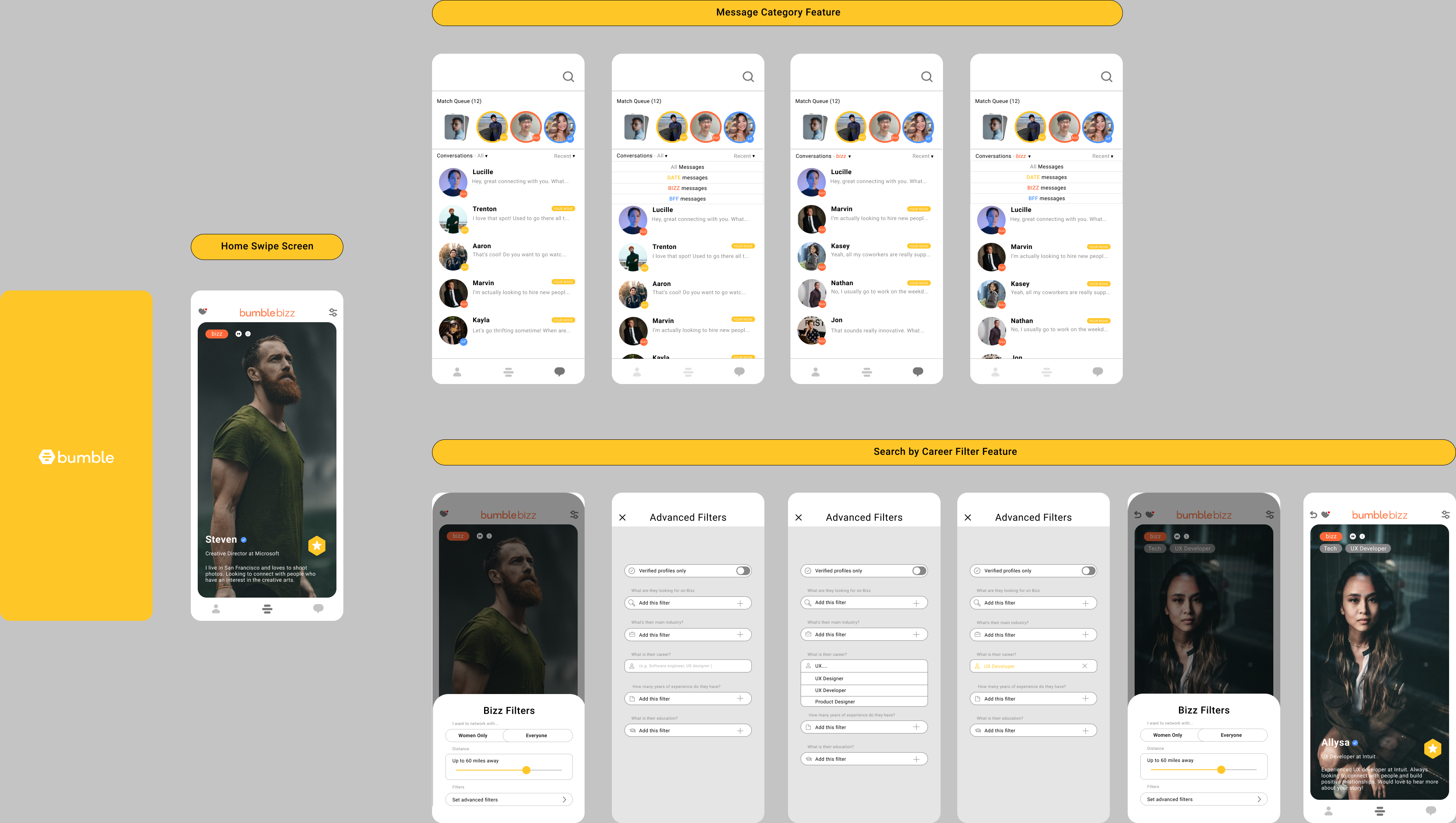
Task Flows
After creating our user personas, we came up with two functions we wanted to implement to improve the quality of use in Bumble Bizz. The first was the ability to sort out the messages in order to separate the three functions from each other. This feature was aimed at users like Jessica, would could be using the date function and Bizz function simultaneously, albeit with entirely different goals in each app. The other feature was implementing a career filter. Bumble Bizz already had functionality of filtering profiles by industry ( i.e. Tech, Arts, Healthcare, etc) but we thought it was important that people connect in certain career paths as well. This feature was considered for people like Jake, who are seeking to make specific connections within their work field, or new connections outside their career path. However, we wanted to make sure both features could improve the overall quality of use in Bumble Bizz so that all users could benefit.
Low Fidelity Prototype
After making some UI sketches and task flows, we decided to put together the designs that we thought were the most user-friendly. We created two versions so that we could conduct A/B testing to fully explore our options moving forward.
Message Sorting
We wanted to reduce the cognitive load that users experience when looking at their messages in the original Bumble messaging design. With Bumble’s current design, all of the services’ messages are located in just one message inbox with no way to organize them. With our redesign that purposefully categorizes each message by service type, users can efficiently navigate to their preferred messages. This is important because they won’t feel overwhelmed by the sheer amount of messages they may receive on the daily from all the services. We made 2 iterations of the message organization system: a hamburger slide-out menu and a tabbed drop-down menu. We decided to design these 2 iterations because they were the most familiar design conventions in terms of organization. The hamburger menu was inspired by popular messaging services such as Gmail, while we chose to implement the dropdown menu out of respect to the standard filtering convention. Having the filters on the same screen as the messages ensure they are more accessible and the users would not have to go to a different page to organize their inbox.
Career Filter
One of the biggest pain points we sought to resolve was the lack of an ability to search by career. We implemented a “career” filter to allow users to further refine their searches. We thought searching for only “industry” was too broad of a filter. However, I understand that Bumble may have purposefully implemented it this way to broaden the range of potential conversation, but I think it is a necessity to help people make the meaningful connections they desire. In order to avoid potential head-hunting in the app, I believe other careers outside the desired career should still be available to the user.
We created two different versions for the filters. For version A, we decided to put all the filters on one page to create a one-click see all filter management system. For version B, we stuck to the original Bumble implementation of filters with the added “career” filter to see the user testing participants’ preference.
High Fidelity Prototype
Both of our UX flows were combined to compose our high-fidelity prototypes. Our prototypes from Milestone 4 received mixed feedback from our peers during the A/B testing, so we decided to implement elements from both low fidelity prototypes into our high-fidelity prototype. People specifically liked the drop down message menu from prototype B, and the filter system from prototype A.
We were excited to start on the High Fidelity prototype because one feature we discussed depended on the usage of varied coloring. While working on the message sorting feature, we added colors to distinguish between the different Bumble services (Bizz, BFF, Date). By adding color components, we would hopefully reduce the user’s visual workload by creating clear distinctions between the Bizz, Date and BFF. Additionally for the career filter feature integration, we added grey tags on the profiles so that the user could confirm the filter was giving them the desired result. We felt that even though these were primarily UI changes, they had a greater effect on the overall flow.
After showing our high-fidelity prototypes to a few users, we made some UI improvements to convey a greater clarity of purpose. One of our users wasn’t initially sure if they were on the bizz or date side of Bumble. With the addition of “bizz” incorporated into the logo on the home swipe feed, users would be able to distinguish between the varying sides. We also discovered that users were not sure about the hamburger menu's purpose, which we decided to rework into a more clear signifier. One feature we didn’t touch during this case study was the hamburger menu which allows you to filter the messages by “unread”, “recent”, “nearby”, and “archived” statuses. We realized that the hamburger menu only served one function, so in order to reduce the clutter, we granted the user direct access to that dropdown menu. We also made the “all” and the “recent” both grey to connote usability. In addition to our efforts to color code the different sides, we added small circles to the profiles in messages in order to make the corresponding side clear.
Before: The color and logo is on brand to Bumble’s overall branding. The yellow was pointed out to primarily reference their dating side, and mislead users to thinking they are not on the bizz side of Bumble.
After: We changed the color and logo name to accurately depict what Bumble service the user is currently seeing on their swipe feed. Users won’t have to question what service they’re using since it’s clearly shown at the top of the swipe feed.
Before: Users found that the menus side by side were confusing, and they prioritized the hamburger menu over the direct message menu. This was a problem of clarity because the hamburger menu only covers one feature.
After: We changed the bar that spans above the messages to incorporate a more intuitive feel. We replaced the hamburger icon with the "Recent" to directly portray the functionality of that dropdown menu. This made the bar more organized and have a much more natural consistency.
Final Iteration
Figma Prototype
Reflection
The core of our mission was to strengthen alternatives to LinkedIn. We wanted to create a more informal setting to make new connections, and we believed that Bumble Bizz had the potential to do that.
I believe that the career filter and message sorting were huge steps in creating a dedicated networking experience, but the branding refocus has the most potential to influence the quality of connections. I believe these changes will foster a more professional atmosphere, and break away from the dating app conventions. This combined with the ability to find individuals by career seeks to recreate the atmosphere of in-person networking events, and increase the chances of building fruitful connections.
One area I would have definitely wanted to focus on with more time allowed was the architecture for navigating between the different services. In order to go from Bumble Date to Bumble Bizz, the amount of screens you had to go through felt tedious because the switching function was hidden deep in the settings. Even though there was a full UI reset, I felt that we could have conducted research on multi-service users to explore how to accommodate that level of switching.